
On Seeing
Essay by Harrison Cook
At one point this November, you couldn’t log on to social media without seeing some form of content about the anticipated part two of the hit movie based on a musical based on a novel based on a movie based on a novel based on a play. Of course, I’m talking about Wicked: For Good. It shouldn’t surprise us Wicked took the visual culture by storm, much like its predecessors did. Common phrases like “There’s no place like home” or “Toto, we’re not in Kansas anymore” are stitched into our vocab, flickering in our collective DNA. Conjure an image of the technicolor, ruby-colored slippers, and you’ll see them stomping down the yellow brick road.
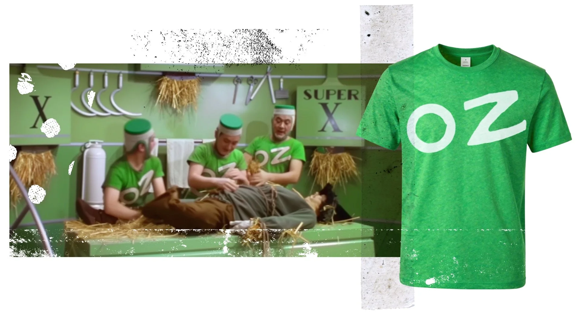
In preparation for the tornado of Wicked content, Laughing Squid conducted a deep dive, which other open-sourced publications regurgitated, leading to no less than seven other articles outlining the possibility of The Wizard of Oz inventing the graphic tee. The scene in question features three spritely straw stuffers from the Emerald City putting the Scarecrow back together, a tasteful “OZ” in a footed typeface printed on their chests. While the subject of whether or not The Wizard of Oz created the graphic tee has been written to death, the idea of seeing something for the first time has no extensive grimoire.
In 1939, wearing a T-shirt, let alone a branded one, was a thing of the future. T-shirts, as a piece of clothing, were thought in the same vein as underwear and socks—something to provide comfort and certainly never to see the light of day. When denim became the default fabric of the United States’ laborers, the plain white T-shirt was its natural complementing garment. Blue and white—that’s two-thirds of Old Glory right there.
In the late ‘50s, Hollywood stars like Marlon Brando and James Dean transformed the T-shirt into symbols of youth, white cuffs rolled up, paired with a cigarette and slicked back hair. The opposite of the sweater-wearing, pencil-pusher model of the learned man. The T-shirted body was a canvas—it only makes sense brands moved in to colonize that space across our chests. Branches of the military, beer brands, and The Wizard of Oz merchandise were some of the first examples of graphic tees in the “real world,” which paved the way for the hyper-graphic nature of the ‘60s and ‘70s. Band culture, protest mottos, and capitalist slogans flooded the graphic tee market, giving the wearer the ability to signal their stance without even vocalizing it. The New York Times would later summarize this with “[graphic tees] were the medium for the message.”
Hyper-graphic-tee-ification filled the visual field of the late ‘90s. Everything was slapped onto our bodies. Our chests, our heads, our sneakers were walking billboards for stuff we could buy, words to live by, and things that fall under “just ‘cause.” The rise of the graphic tee also probably tangents the rise of capitalism. The rise of the graphic tee also tangents anti-capitalist sentiments. The rise of the graphic tee also mirrors the “fuck it and find out” attitude a modern graphic tee wearer is accustomed to today. By the time I rewatched The Wizard of Oz, it didn’t seem out of place or revolutionary to have a screen-printed T-shirt in a movie. The graphic nature of these tees, the word “OZ” bannered across the men’s chests, almost invokes the hand-painted sign of a drugstore window, doesn’t seem out of place in the magical allegory for the progressing future. The typeface of the graphic “OZ” tee has an angular bend to the lines with serifs ending in calligraphic parallels. Something gilded, classically designed, something made to be timeless. The accelerated graphic culture buried the innovative graphic “OZ” tee in plain sight, and upon its discovery, I realized maybe our way of seeing had changed.
It’s often believed that good design doesn’t call attention to itself. It’s seamless. Invisible. Blends in and redistributes its colorful receptors like a chameleon to its surroundings. When I took a book-making class, the spacing, kerning, and leading screamed in my mock-up assignments. My eyes were magnetized to what’s wrong or off. That’s why the typeface Helvetica is the typological scaffolding of modern society. Sans-serif type fonts (unfooted) are easier to read, especially from afar. It makes sense a green sign on the highway should be easy to read, just in case you have to jet across multiple lanes of traffic to make your exit. But what if a billboard or a green directional sign on an overpass were blank?
From 2000 to 2010, the visual artist Matt Siber created works of altered photographs called the The Untitled Project. Here, public spaces like malls, billboard hubs, and main streets were digitally stripped of words, leaving only blank shapes and images. Logos, advertisements, and marginalia were transmuted on the corresponding blank page, “presenting the text that appeared in the photographic space without 3D photographic perspectives.” The result is a juxtaposition of what our brain expects and what is new, forcing the viewer to truly look for the first time. How much of our visual landscape is advertisement and logo, let alone the digital one we plug into daily?
Uncanny is my brain’s response when seeing the shapes of signs within Siber’s work. The visual landscape is clotted with marginalia, and being comforted without it wills my brain to consider shape, color, and line. Words signal to our brains, “context”. Otherwise, the interstate signs for Fresh Apple Pie and Gas Station Bathroom are almost identical. But also consider the image of a red octagon without its word, signaling to drivers whether to make a full stop. Color, shape, and lines also provide context. Without “OZ” screen printed on their tee shirts, the three elfish men would be labeled the working class as Scarecrow stuffers, and the argument of the clickbait pieces “Did The Wizard of OZ create the first graphic tee?” would be null.
The visual imagination is drowning in words. Yours, mine, everybody’s. So much so, the “first” OZ graphic tee would be discovered almost 86 years after its film debut. It takes stripping the words from media to truly see how much we’re fed.
Oh, the overstimulation.
***
Harrison Cook is a writer, potter, & thinker living in the Midwest. His work has been published in Future Tense, Gay Mag, Foglifter Journal, Gargolye Magazine, TriQuarterly Review, and elsewhere. Keep a lookout for his next creative adventure, Future Artifact (coming 2026).